Artscapy Design System
Lead Designer | Design Systems | 2021
Overview
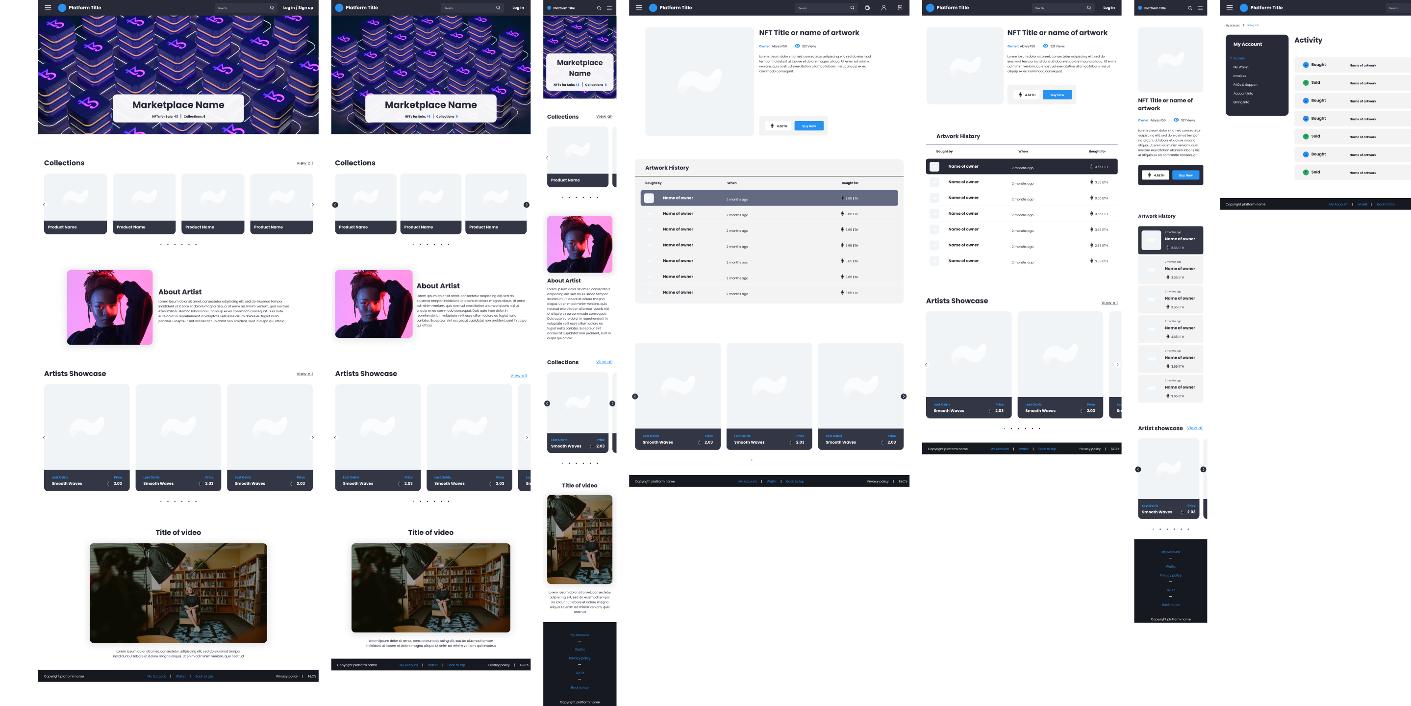
The world’s first Art Account. From collection management to art valuations, insurance & art trading. We partnered with Artscape to create their new platform for buying and selling highly desirable pieces of art, giving you the ability to speak with auction houses, and keep track of your profits and losses all in one convent place. Alongside these designs, I created a full design system at an atomic, molecular, and organism level.
My Role
Research
UI Design
Design Systems
Team
Front End Developer
Product Owner
Lead Designer (Me)
Tools Used
Figma
Storybook
Brief
Design and create a fully functioning design system to will allow Artscapy to expand and adapt their platform along side their business
Objectives
Consistency: Develop a consistent and unified design language across the entire platform to ensure a seamless user experience.
Efficiency: Streamline the design and development process by providing reusable components and guidelines, improving efficiency and reducing development time.
Scalability: Create a design system that can scale as the platform grows and accommodates new features and updates.
Benefits
Saving a lot of time.
Enabling and facilitating collaboration and consensus.
Ensuring UI consistency (often associated with increasing brand trust).
Creating a foundation for further improvement.
Reducing complexity and ambiguity.
Inventory
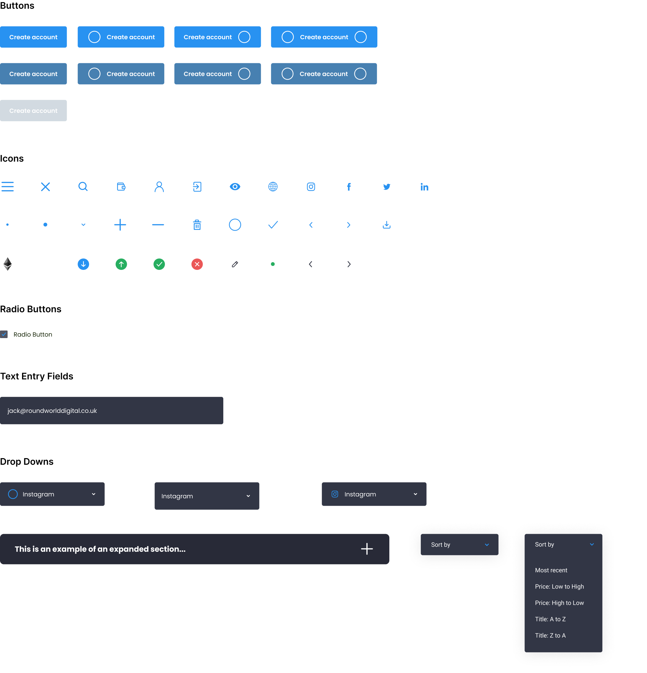
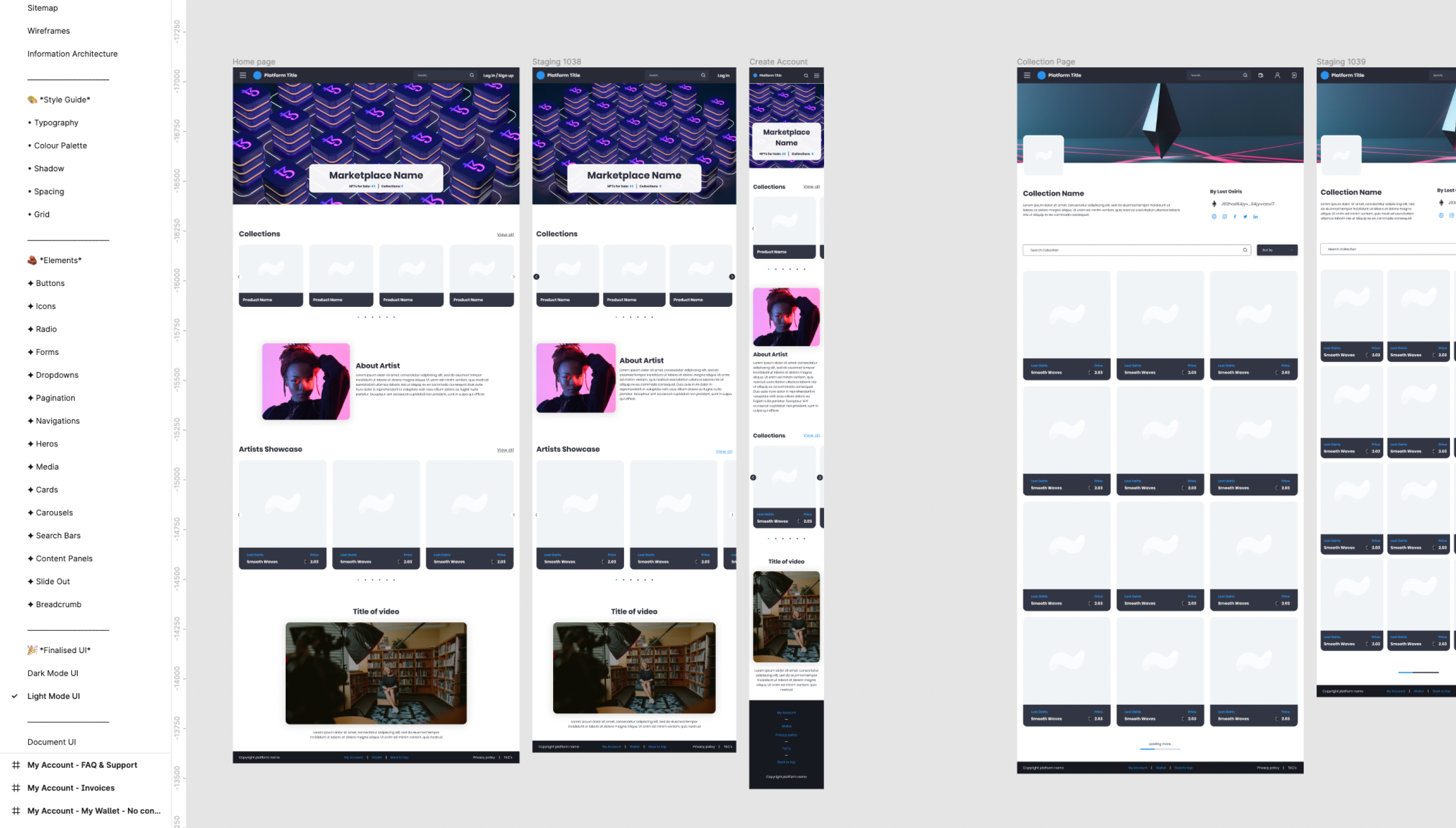
The first step I undertook was to create an inventory of every UI element in the new application. I took every page, every modal, every menu, and well…everything in the web app and created a comprehensive list of everything single element created.
Audit
Once I felt I had captured every button, icon, and design pattern I grouped them into categories. Viewing them side-by-side revealed exactly why we needed a system. There were dozens of buttons styles, incorrectly applied font weights, and single-use icons all over the site.
Component Design and Development
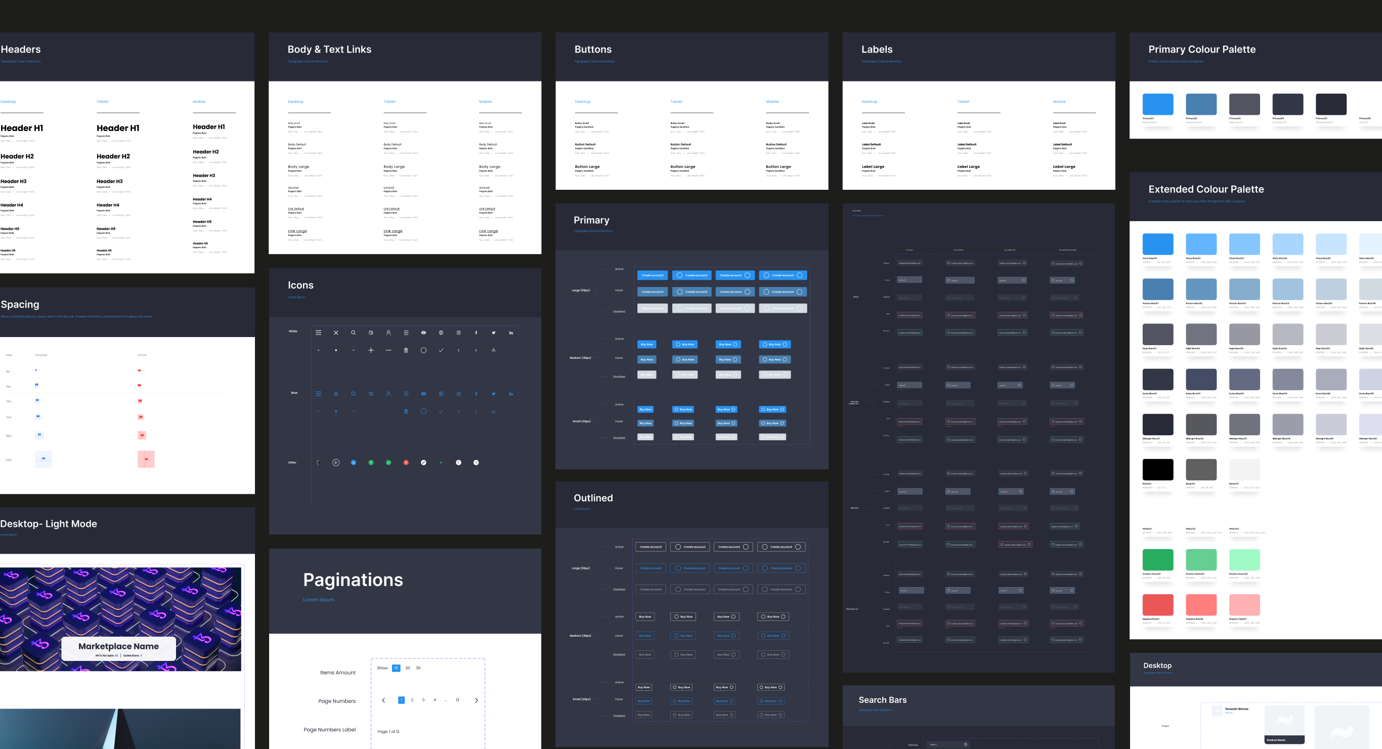
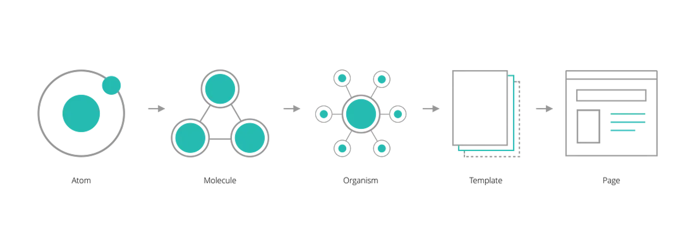
Adopt the atomic design methodology, breaking down components into atoms, molecules, organisms, templates, and pages, allowing for a systematic and modular approach to design.
Editing
This was the most time-consuming portion of the project. I had to make decisions regarding naming conventions, categorisation, organization, and presentation. I spent a lot of time naming and renaming my Figma layers and organising my symbols page.
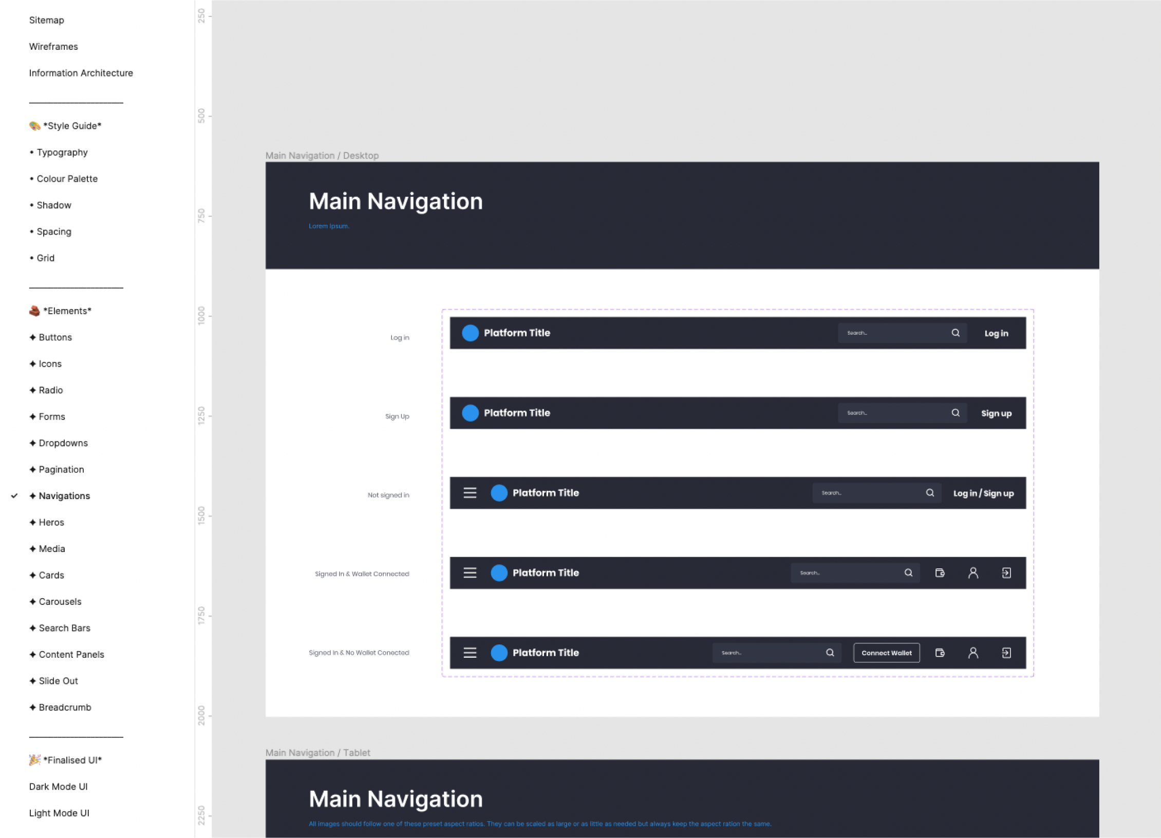
Variants
Once I had listed out all the components that were present in the designs, it was clear that everything created was very surface-level.
I needed to comb through all the components and create a much more robust system that had every possible variant of both design and development needed to create a rounded system
Using variants makes components easier to maintain, browse, and swap through the sidebar menu.

Documentation
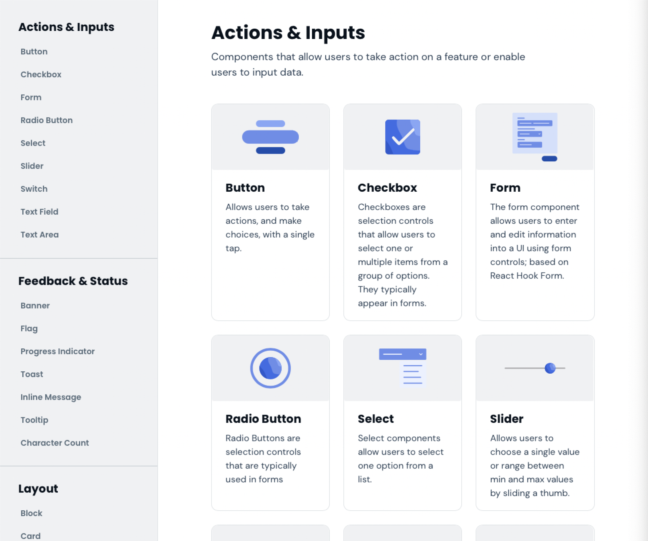
High-quality component documentation is crucial to an effective library allowing everyone to quickly and efficiently make consistent decisions.
We wanted to create detailed documentation that would support every single aspect of our design system, and also be organized, consistent, and easy to use. We referred to several design systems such as IBM’s Carbon, Material, Atlassian, Salesforce Lightning, and other design systems for some good practices, guidelines, and tools that we could apply in our design system.
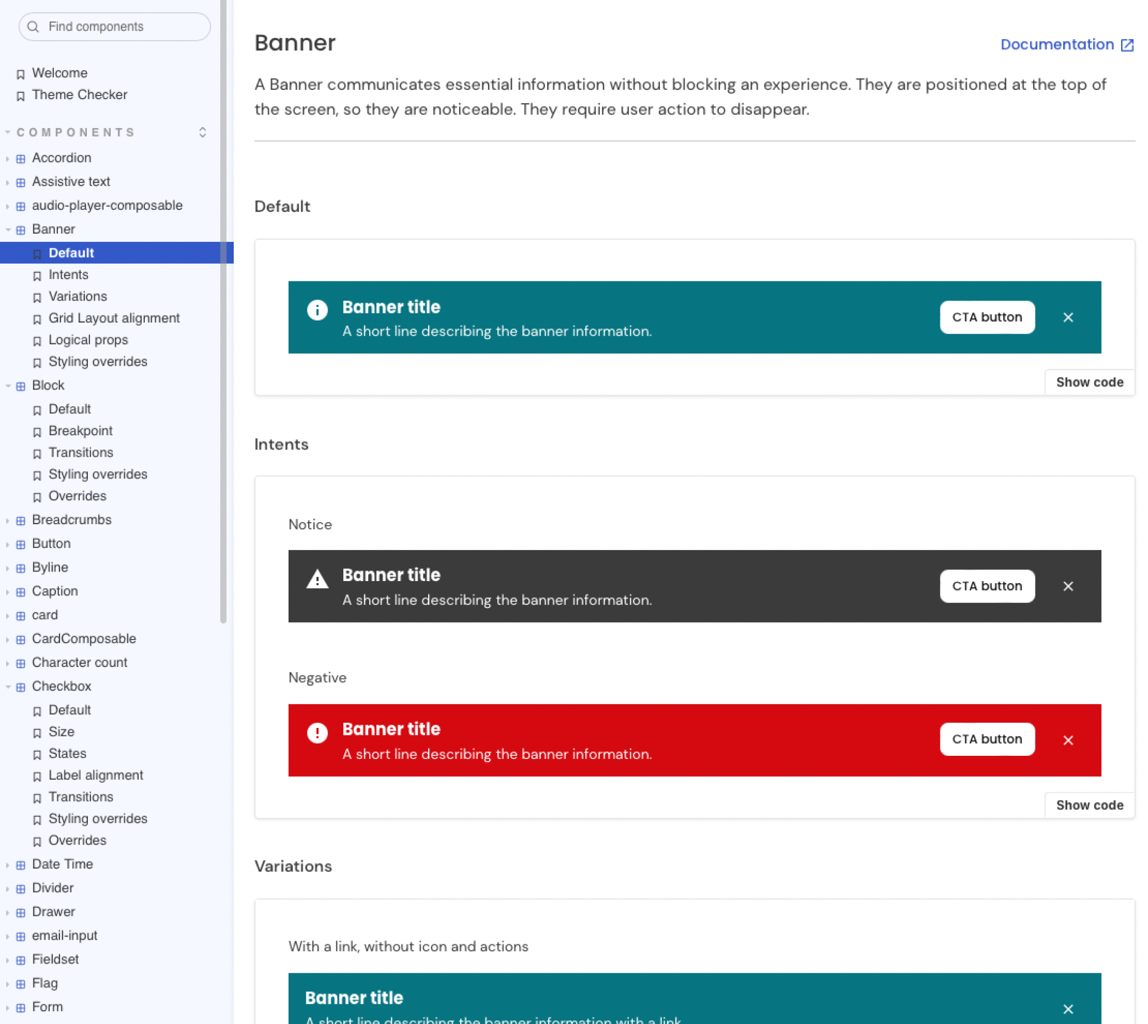
Storybook Components Repository
High-quality component documentation is crucial to an effective library allowing everyone to quickly and efficiently make consistent decisions.
We decided to build out our new repository from scratch in Storybook, a tool that allows to create an interactive pattern library for code in isolation and supports all the popular frontend frameworks. It allows to document use cases as stories and easily find, share and reuse them. Just like Figma, it also integrates with Zeroheight, making it easy to sync and align documentation between development and design.
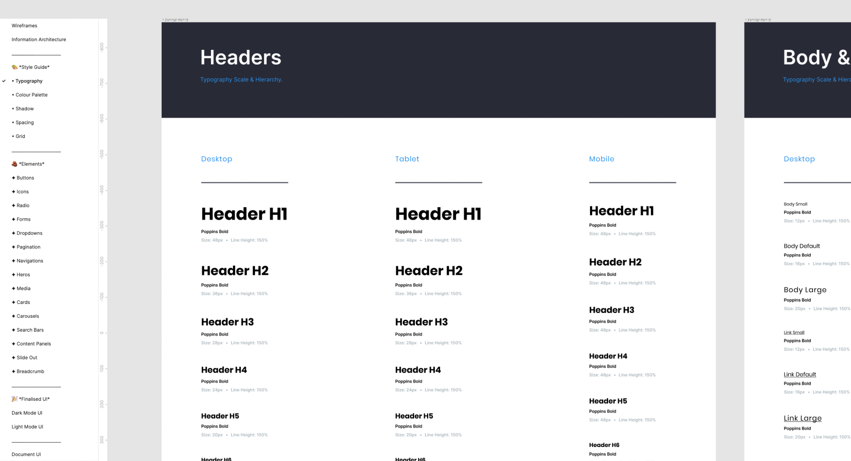
Naming Conventions
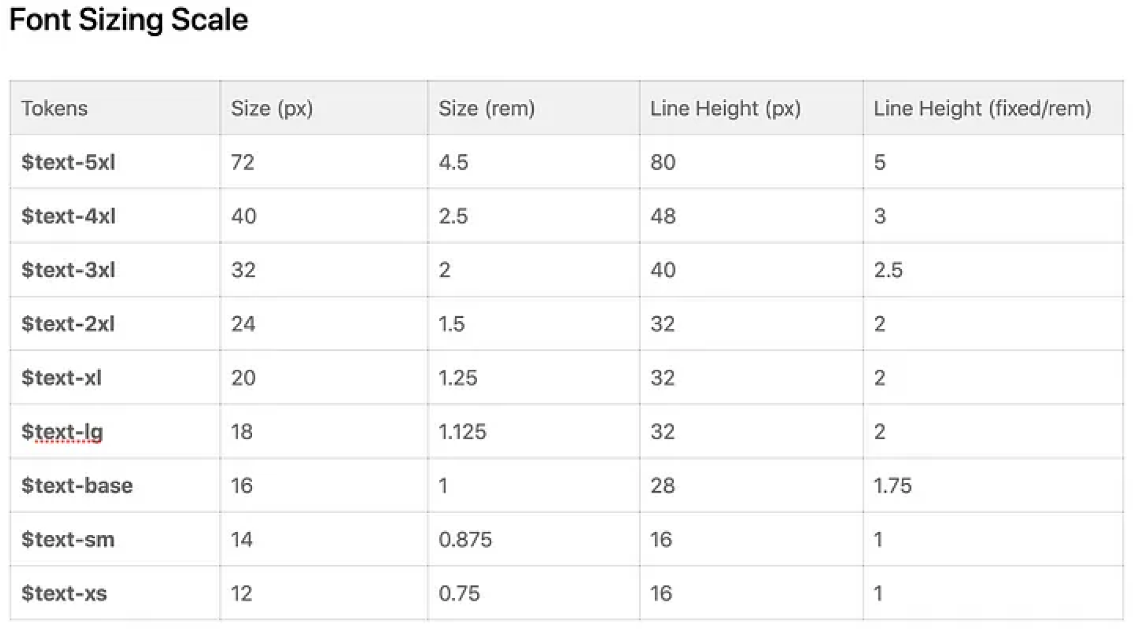
To ensure everyone is on the same page and speaking the same language, we aligned on consistent, clear naming conventions between design and code, be it font styles, colours, spacing, icons, etc.
The table below specifies font sizes and line spacing in text styles. For convenience, each style is named the same as in the code.
The Future
The design system is an ongoing project. So far, we have a set of basic components ready, which has been game-changing for the Artscapy team in terms of efficiency, as well as consistency, and standardisation.
After handing the system back over to the team we aim to help them keep improving. Here are some of the next steps:
- Continuing to grow our component library and supplement it with more complex components.
- Adding sections on brand, illustrations, and animation.
- Cultivating processes and best practices for maintaining the documentation to ensure that our library stays up to date and perfectly in sync both on the design and code side.
- Raising awareness across the teams and promote adoption and contribution to the documentation.
- Building processes for testing the components on compliance with guidelines and accessibility standards.a
You’ve made it this far! Click here for a surprise