Black Forest Tourist Destination App
Lead Designer | B2C | App Designs | 2021
Overview
Hey there, this is the default text for a new paragraph. Feel free to edit this paragraph by clicking on the yellow edit icon. After you are done just click on the yellow checkmark button on the top right. Have Fun!
My Role
Research
UX Design
User Testing
UI Design
Team
iOS Engineers (2)
Project Manager
Lead Designer (Me)
Tools Used
Figma
Userzoom
Brief
Hey there, this is the default text for a new paragraph. Feel free to edit this paragraph by clicking on the yellow edit icon. After you are done just click on the yellow checkmark button on the top right. Have Fun!
Hypothesis
Implementing an offline-capable native app that centralises visitor and local services, such as the Red Card system, will increase user engagement and satisfaction by improving connectivity in remote areas of the Black Forest. This, in turn, will ensure that discounts and commissions are applied accurately and efficiently, reducing the dependency on pre-booking and enhancing overall user convenience.
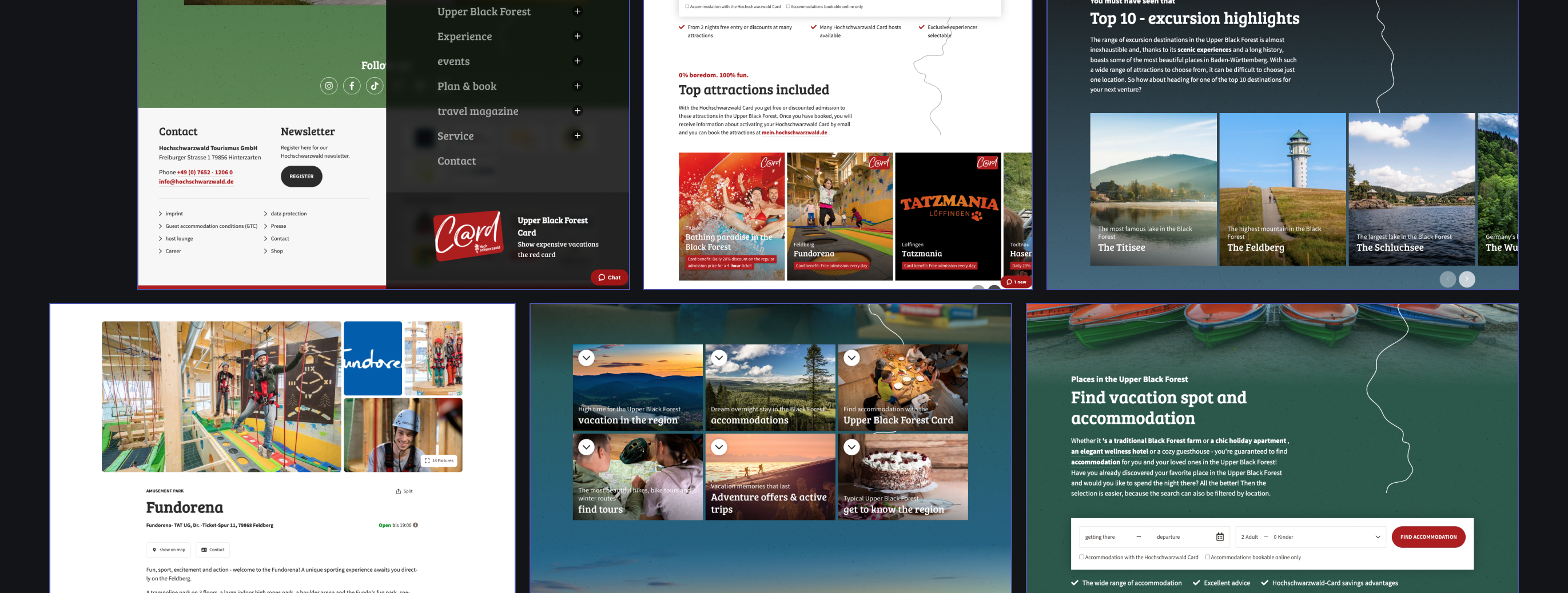
Current Offering
Access to attractions in the Black Forest region is currently managed through a single website, which functions both as a showcase and booking platform. However, this dual-purpose design often makes it challenging for users to quickly find what they're looking for. The website lacks a dedicated space for users to view their booked attractions or accommodations, requiring them to rely on email confirmations to track their plans, which complicates spontaneous visits and can lead to a need for extra preparation.
Challenges
Create a Dedicated Booking Dashboard: Develop a personalized area within the app or website where users can easily view all their booked attractions, accommodations, and other services in one place.
Implement a Filtered Search and Discovery Tool: Design intuitive navigation and search tools that allow users to easily filter attractions, events, and hotels, separating booking functions from showcase content to streamline the user journey.
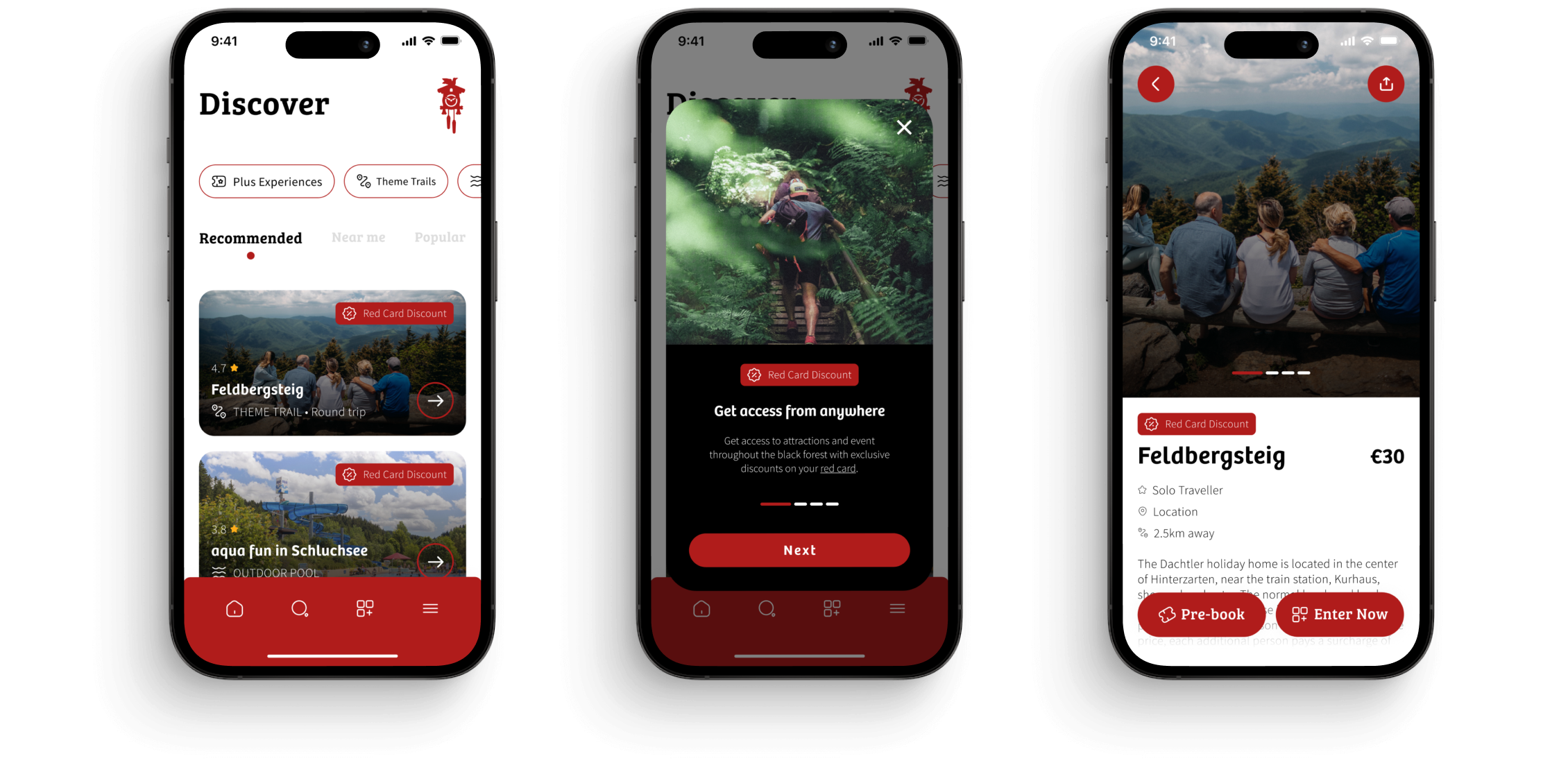
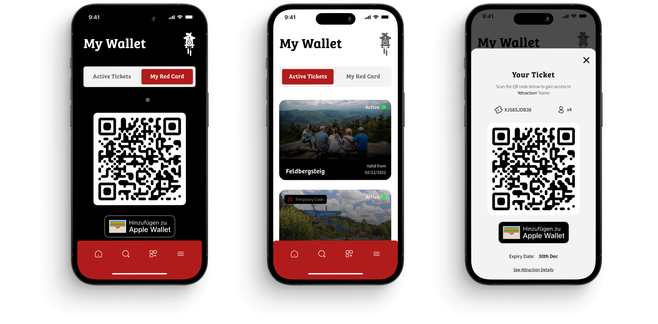
Introduce In-App or Digital Ticket Storage: Offer a feature that stores tickets directly in the app, allowing users to access them offline without relying on email. This would support both forward planning and spontaneous visits.
Enable Real-Time Notifications and Updates: Add a notification system that provides reminders and updates for booked activities, so users are informed about their schedule without needing to check their email.
Common Use Case
When speaking to the client and users we mapped out what the most common user journey currently is for the offering and highlighted where the pain points exist.
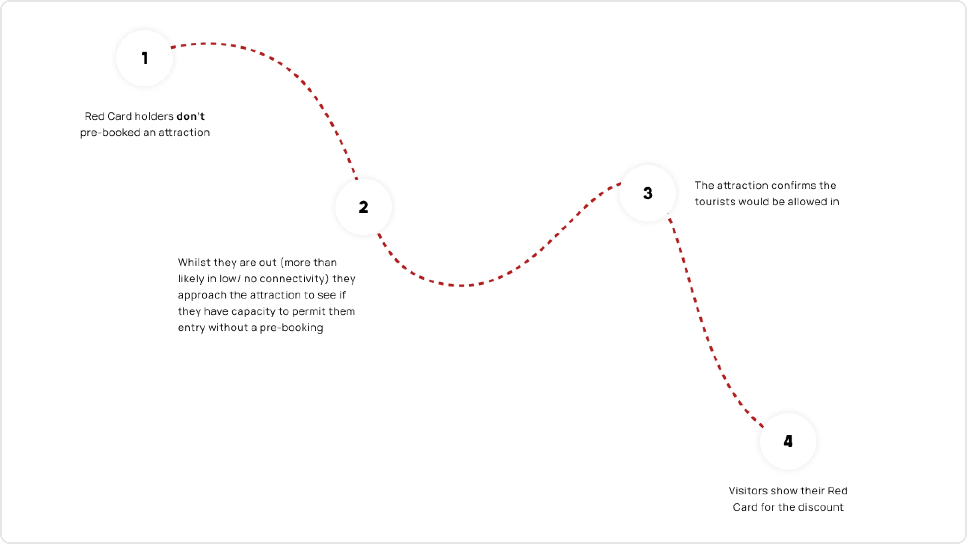
Key Problems
Tickets
Without pre-booking attractions, gatekeepers and users have to manually apply the Red Card discount which is complicated and time-consuming.
Loss of earnings
Black Forest loses potential commission if users can't gain access to the internet.
Booking Journey
The booking journey is long-winded and inconvenient for visitors
Customer Satisfaction
It's a common occurrence that users become dissatisfied when they can't gain access to an attraction because of the internet.
All of the above are problems created from a lack of connection in remote locations.
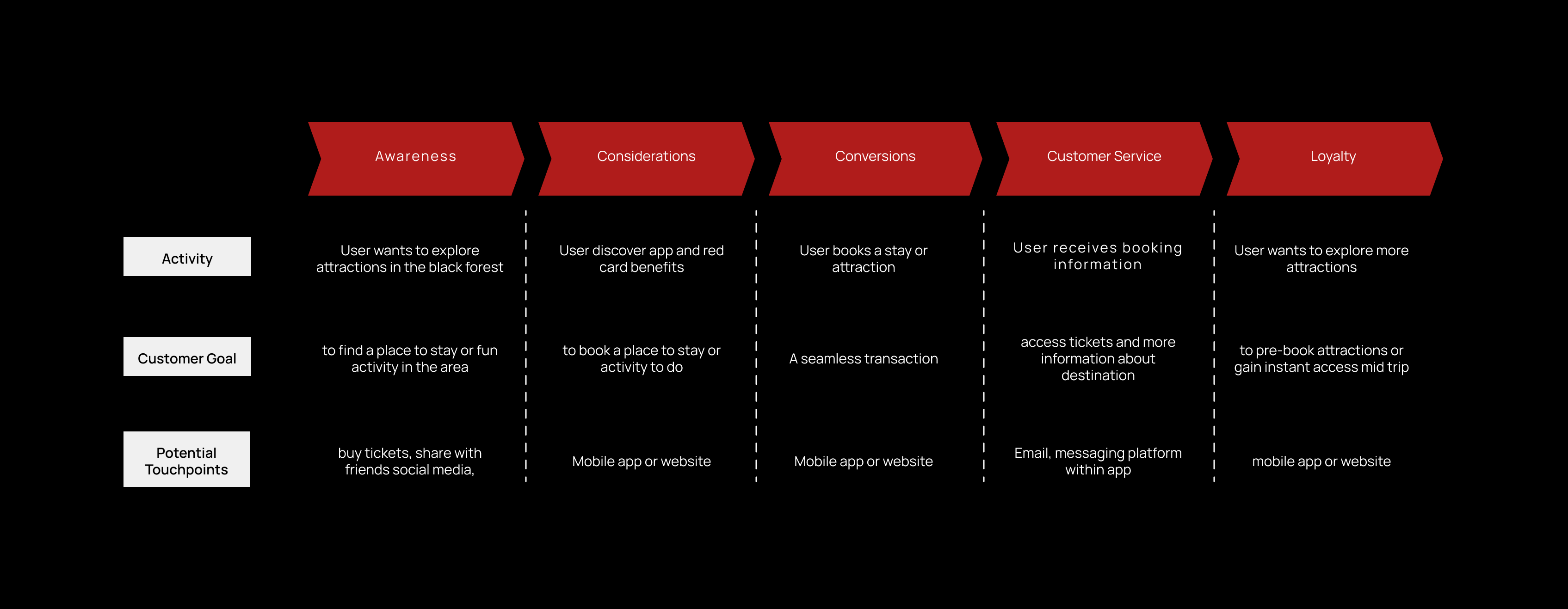
User Journey
With these problems in mind, we mapped out the ideal user journey that would best serve The Black Forest team and the users together.
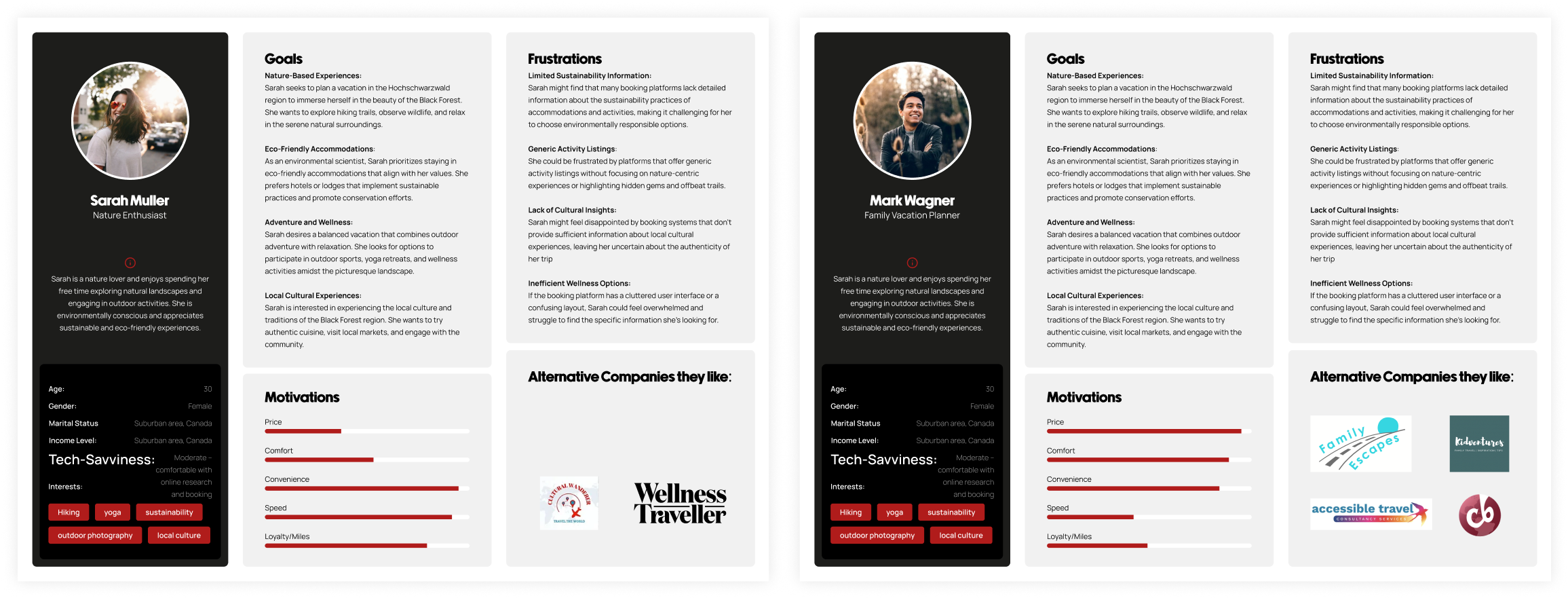
Personas
With these problems in mind, we mapped out the ideal user journey that would best serve The Black Forest team and the users together.
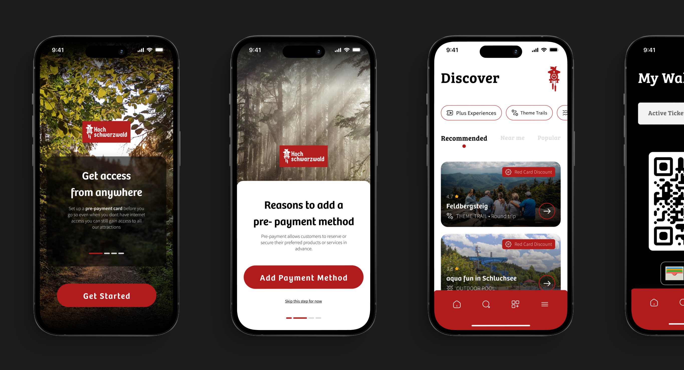
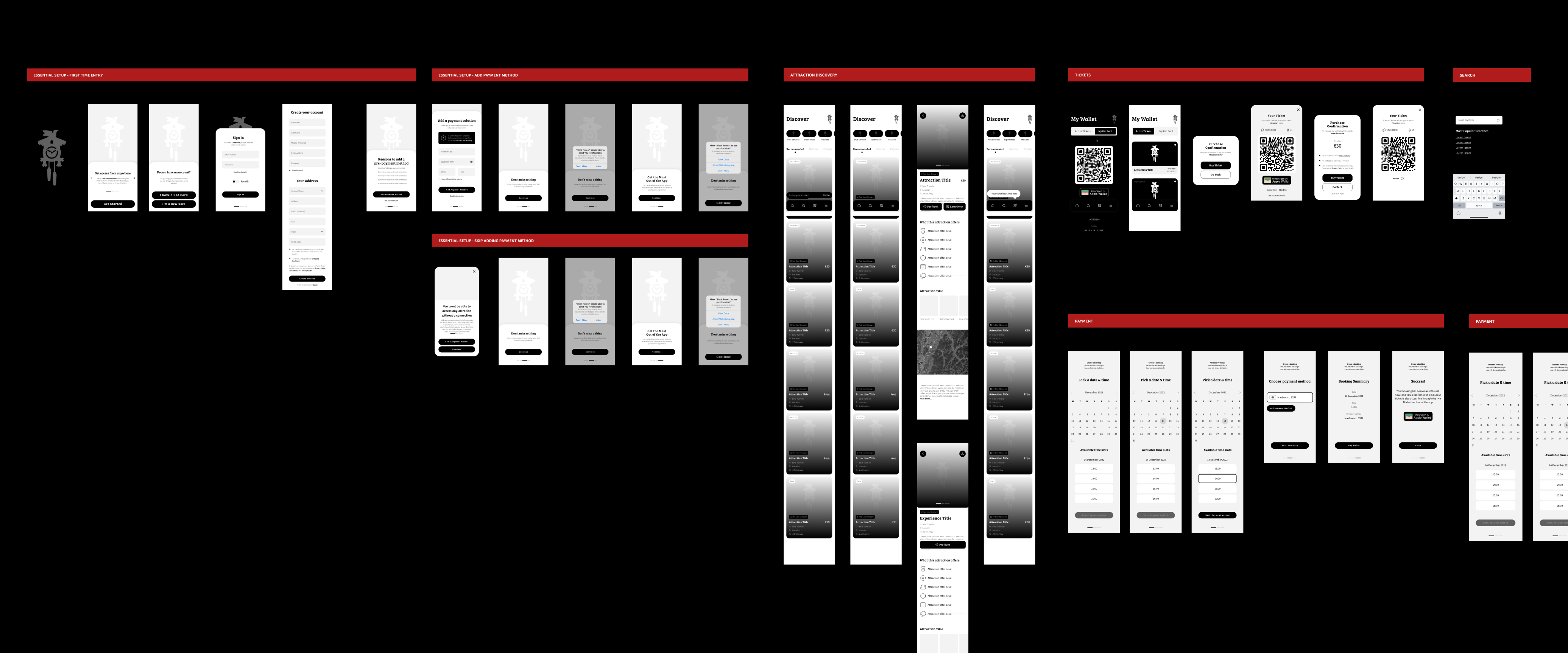
Wirefames
The next steps was to create some tagible we could test and star tbenchmarking our findings so we created a usable wireframe helped us to understand how these user journeys would materialise in to the real world.
To make things clearer I broke this down in to 6 key areas.
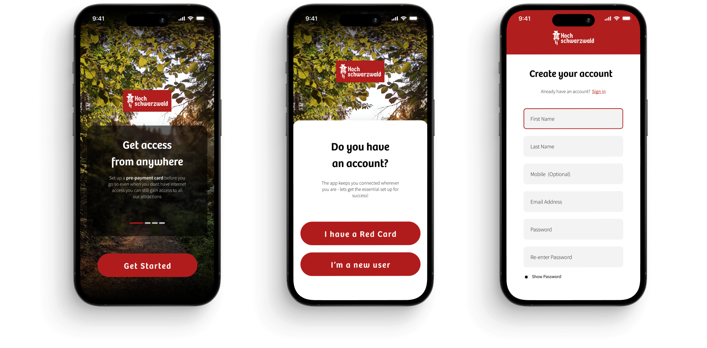
- Initial Setup (New & Existing Customers)
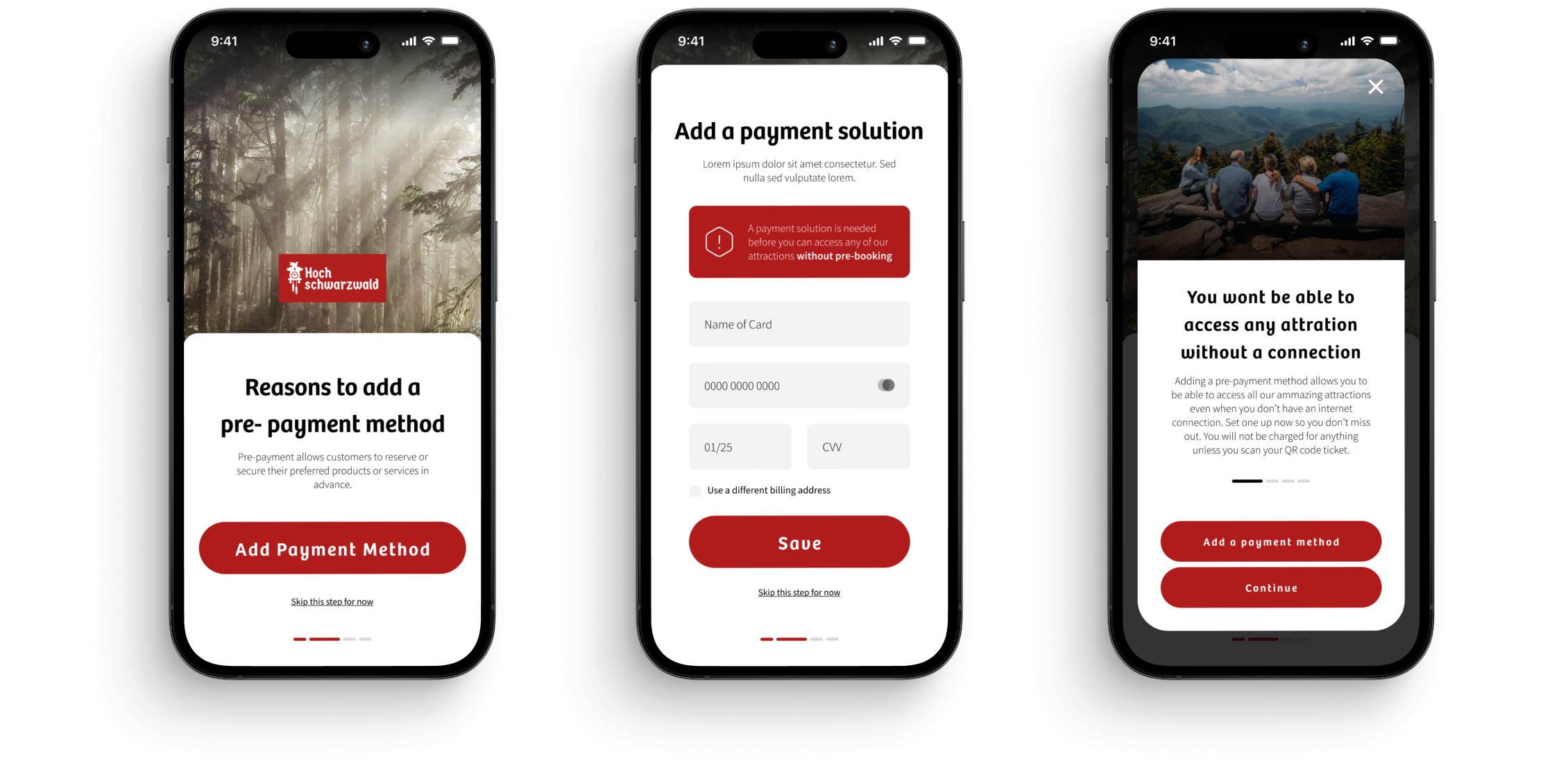
- Adding a payment method
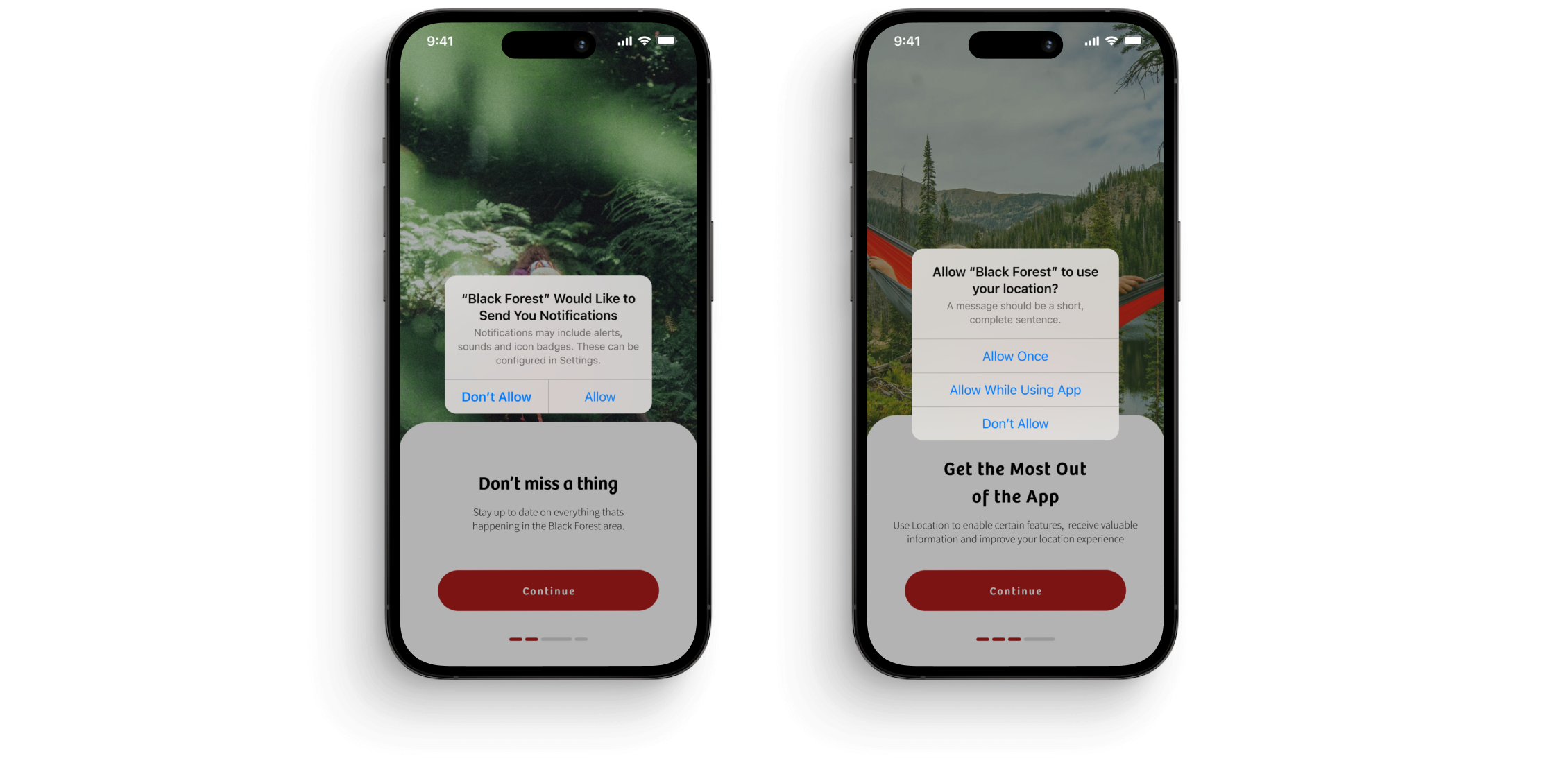
- Onboarding
- Attraction Discovery
- Ticket Access
- Booking / Payment
Moderated Testing
We conducted a moderated testing with 30 subscribers, with a mixture of males and females, aged between 40-70, using task-based testing asking users to complete small tasks and give their thoughts and feedback
Gathered a mixture of quant and qual feedback.
30%
of participants weren’t actually aware of the red card & its benefits.
100%
of participants expressed the desire to have access to attractions on the go.
70%
of participants understood the value of adding a pre-payment method, but 90% were apprehensive about being charged unexpectedly.
80%
liked the clear onboarding steps and were confident they could use the app on their own.
20%
of participants understood the value of adding a pre-payment method, but 90% were apprehensive about being charged unexpectedly.
40%
of participants understood the value of adding a pre-payment method, but 90% were apprehensive about being charged unexpectedly.
Latest Designs
The feedback from the tests were very positive and the client was very happy so we thought it best to start creating high fidelity designs to add the extra layer of detail in the prototype ready for another test. In this time we also addressed a couple of the issues that scored the lowest in the previous step.
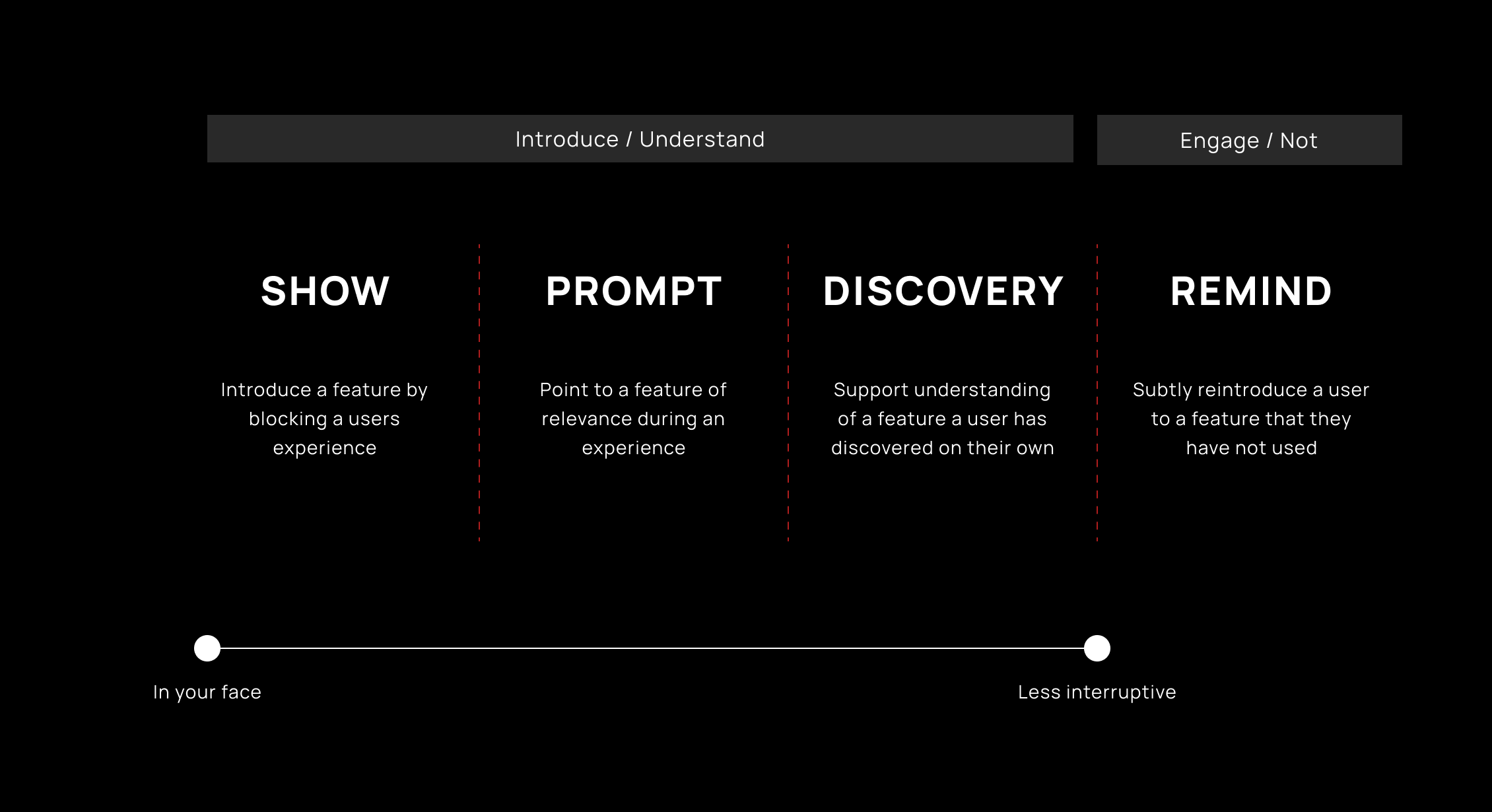
Onboarding Logic
Use a set of principles to define the type of onboarding used for a feature...
Show
- Modals
- Banners
Prompt
- Indicators (notification dots)
- Flags
- Popovers
- Hints
- Toasts
Discovery
- Inlines
- Empty States
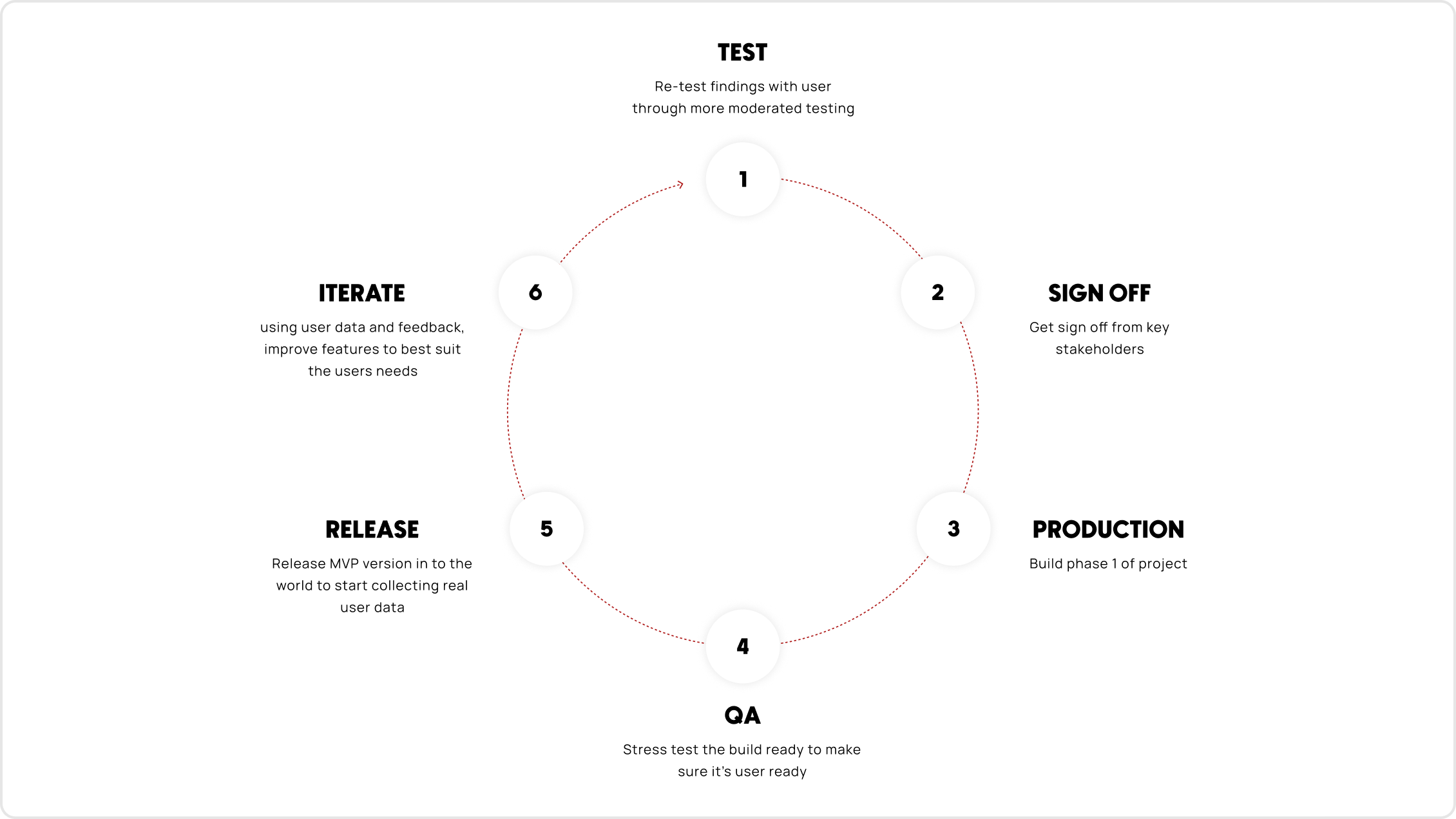
Next Steps
The relationship ended with the client at this point due to circumstances out of our control, but before they left we created a mini plan for future testing and how to refine and improve the product we have created. Unfortunately because of this relationship ending, we were able to collect the final data to see how well the app performs.
You’ve made it this far! Click here for a surprise