The Times New Navigation UX Discovery
Product Designer | B2C | Web Designs | 2021
Problem Statement
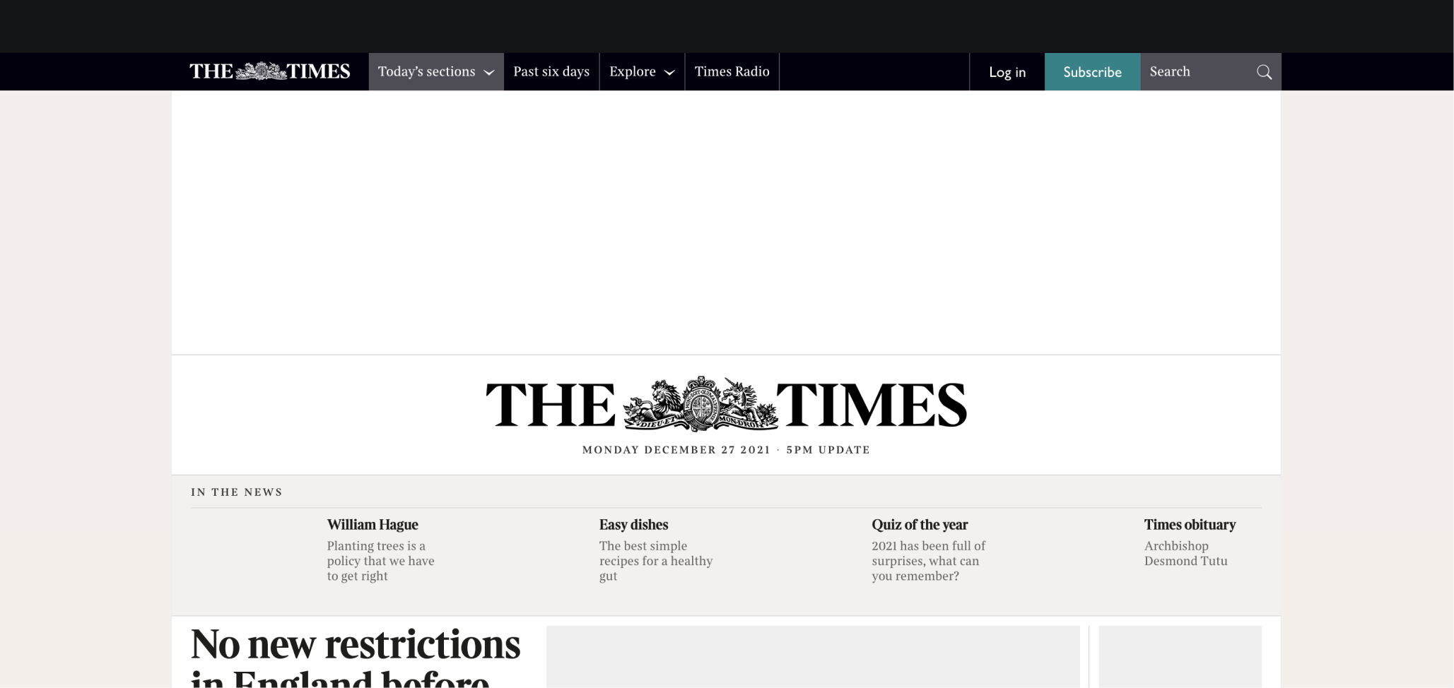
TNL’s current navigation model supports only the edition and channel pages. The breadth of our pages, including subject pages and specials, cannot be included in the navigation model as it currently stands.
Brief
Explore how we can present the edition and content verticals alongside each other on desktop.
Hypothesis
IF… readers can navigate around the edition and content verticals with ease
THEN... we will better showcase the breadth and depth of our content, and we will see traffic to subject pages that align with our KPIs.
My Role
Research
UX Design
User Testing
UI Design
Team
Deputy Head of Digital
Head of UI/UX
Scrum Master
Product Owner
UX Researcher
UI/UX Designer (Me)
Android Engineer (5)
iOS Engineers (5)
Tools Used
Figma
Userzoom
Existing Navigation Exploration
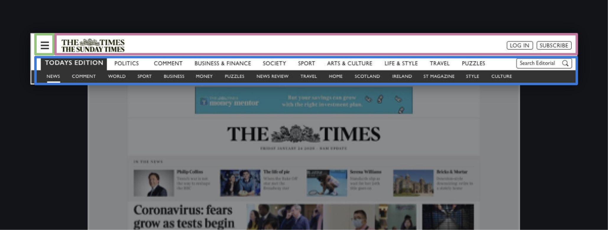
Before I worked at TNL, the UX team at The Times underwent user testing based on competitors' usage of their navigations. This is what initiated the conversation about replacing the navigation model. Below are some quick user outcomes of what happened during those tests and key findings as to what users were thinking.
- Three tiers (Global/Content/Topical)
- The home page shows the latest/biggest headlines
- Channels are visible at all time
30%
of participants expressed confusion with duplicate titles within the content navigation (Same channel names as some subjects e.g. Sport, Travel, Puzzles)
20%
of participants did express dissatisfaction towards the cluttered aesthetic of the mechanism.
Current Navigation Model
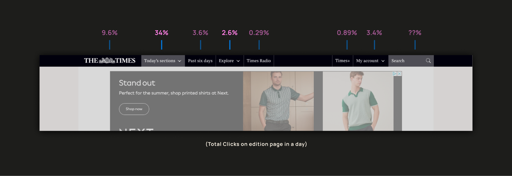
To kick things off we did some research on the state of the current navigation model. As you can see below there was very little interaction happening outside Todays sections. This was a clear indication that something needed to change to help create interest in the extra content users clearer dont know is there. The way the navigation was built we didn’t even have tracking on the search area.
Current Onboarding Model
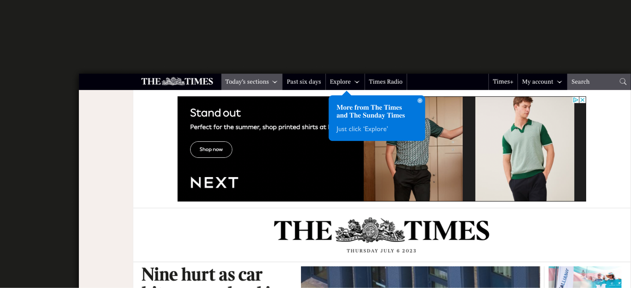
Before looking at creating anything new its important to understand what is failing in the current model. Onboarding can be a key point to help users understand what is in front of them, especially when they haven't seen new features before. through a moderated usability test we gathered the key point below to understand what the user is seeing when they encountered this onboarding process for the first time.
- The functionality of the pop-up is rudimentary.
- Only features on the first load. Once dismissed it doesn’t return - knowing user behavior we know they are likely to not read closely the first time around, they will more likely just dismiss to get it out of the way.
- The wording isn’t informative. There is no description of what “Explore” does. It just repeats what the CTA says - not very helpful when users already don’t understand what they are looking at.
Inital Questions....
Could we use other methods of onboarding? E.g. takeover or walk throughs
Do we need to include some info in marketing emails about new content area?
From this past research, we had some key insights from the previous test subjects. As you can see The Times users are a passionate bunch and will tell you exactly how it is. Going forward it was very important that we included them in everything we want to achieve.
“I’ve used the search thing but I’ve never noticed the explore button before”
Quotes by test participant 01, Malcolm
“I don’t explore, I go to what I want”
Quotes by test participant 05, Bonnie
“I can’t even remember if I’ve ever seen it on the normal tabs, but now that I have, I will be looking for it”
Quotes by test participant 08, Jon
“So is this explore feature something that is on the current site? I don’t remember seeing it”
Quotes by test participant 09, Gary
Research
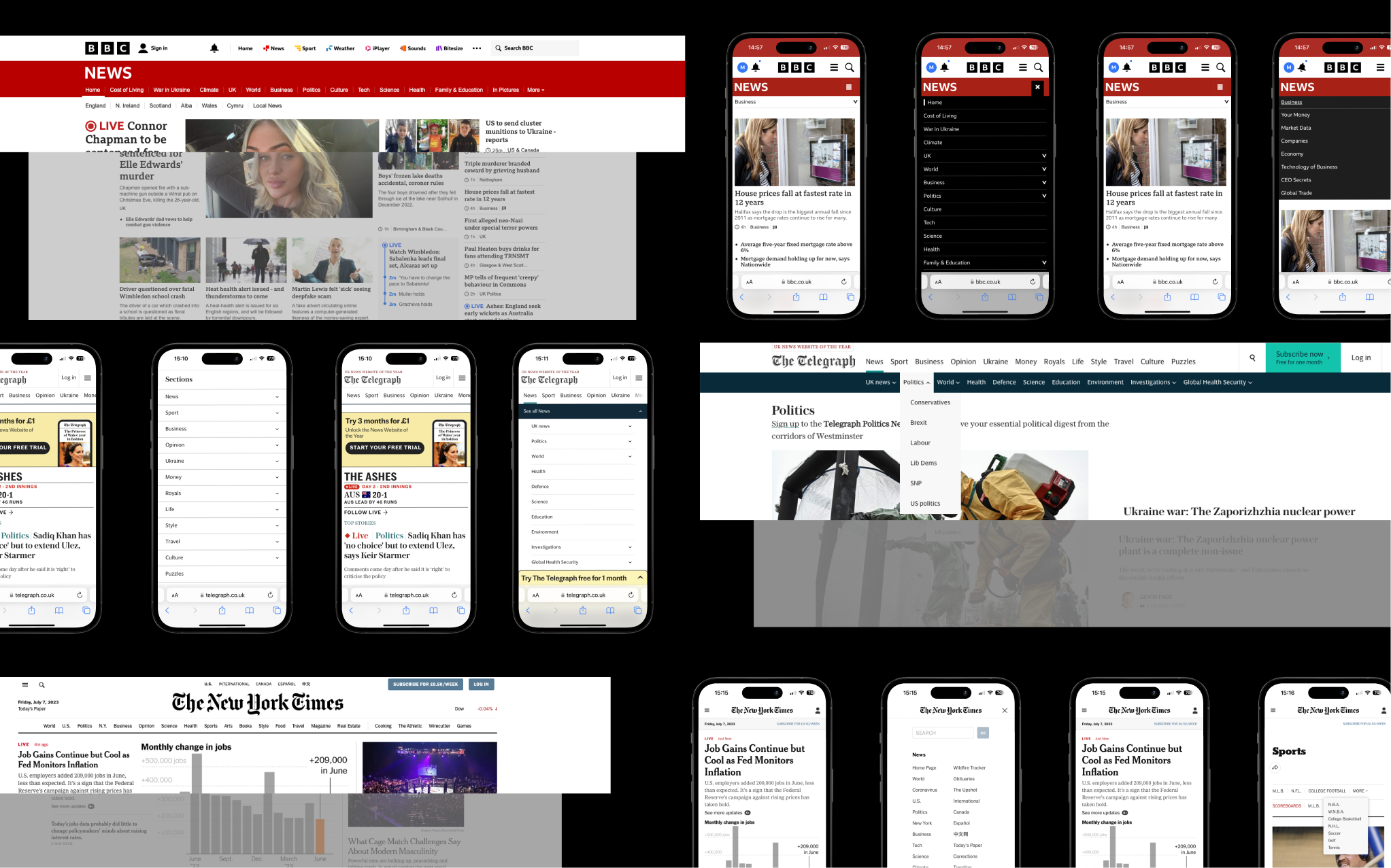
Competitor research is a critical step in any design project. By analysing what others in your industry are doing, you gain valuable insights into market trends, user expectations, and potential opportunities for differentiation. It's not just about identifying what works—it’s about uncovering gaps and figuring out how to do it better. Effective competitor research ensures your designs are not only functional and engaging but also strategically positioned to stand out in a crowded marketplace.
Key Findings
- Make it visible
- Communicate the current location
- Coordinate menus with user tasks
- Make it easy to manipulate
- Do not attempt to ‘wow’ users with navigation
Testing
Our approach used moderated testing, where we guided participants through tasks and watched how they interacted with the design. This hands-on method helped us get real, honest feedback, understand user needs better, and tweak the designs to make them as user-friendly as possible.
Our approach
Moderated testing with 30 subscribers
A mixture of males and females, aged between 40-70
Two groups of 15 testers using two prototypes, each showing different navigation styles
Task-based testing asks users to complete small tasks and give their thoughts and feedback
Gathered a mixture of quant and qual feedback
Web-only for now

Variations we tested
We started with 2 different variations of the navigation to start with. Each featured quite different approaches to help identify successful elements as well as pain-points.
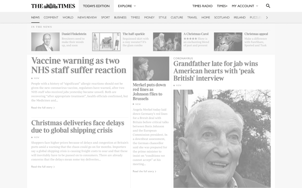
Editions
- Both prototypes, load on Today’s Edition
- All edition sections are now visible with anchor links to relevant parts of the page
- Reduces clicks to find today’s sections
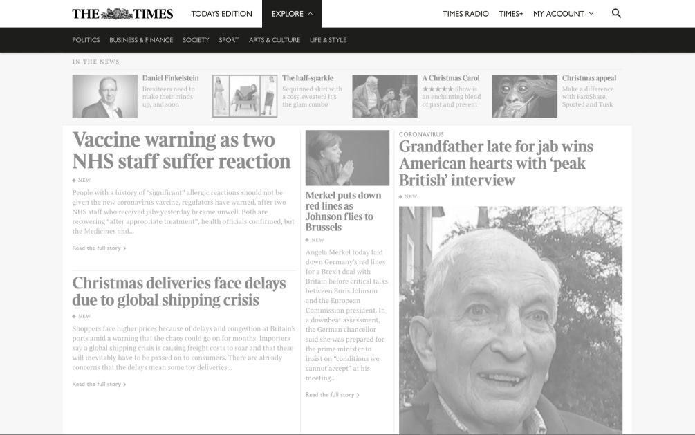
Option 1
- The new secondary menu opens
- Different colours to separate the 2 environments
- Only the channel list present
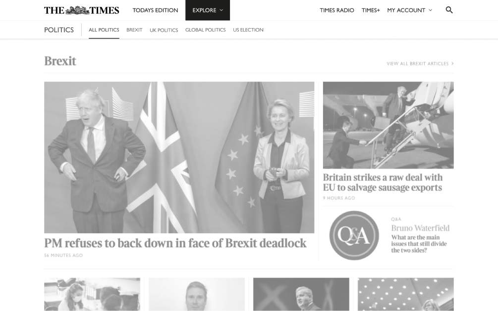
- Topically secondary nav present
- Page title in nav
- List of subject links
- Explore link remains highlighted to indicate the location on the website
Option 2
- All channels are visible at all times
- Hover to see drop-down of subjects
- Easy access to subject pages from any explore page

Pre-test questions
- Before users were presented with a prototype, 50% of participants expressed that they would like to deep dive into topics of interest more easily
- Some participants expressed that they would like to see a navigation where all sections are visible at all times (rather than clicking a dropdown)
- 2 participants expressed dissatisfaction with the “Show more” CTA on the edition page
“When I go to the BBC there is something clickable very quickly to get to the topic I want”
Question: Where would you go to find out about rugby content?
12
Participants selected the Sport section in the edition first
9
Participants required prompting to use “Explore”
4
Participants said they thought “Explore” would be a search environment
Specific vs. Generalised Browsing
100% of participants had preferences on which sections/content they like to read, whilst saying they “skip past” the content that doesn’t interest them
Participants were more satisfied with the presentation and grouping of content in Channels
Participants liked that they could access more content that they liked in isolation, as opposed to scrolling through the long edition page
Question: Rate your satisfaction out of 5 with finding rugby content?
2.7
Edition
4.6
Channel & Subjects
“It’s what I expect, it’s what I like. I can see a lot more interesting content about the topic”
Quotes by test participant 10, Jon
“That’s the kind of thing I was talking about. That way I could get straight to rugby rather than doing it the other way, it just gives me exactly what I want”
Quotes by test participant 02, Michael
“So now you've got what I was saying earlier on, which is that ability to pick out the sport that you're particularly interested in. This works for someone like me very much so”
Quotes by test participant 09, Garry
Users were confused about the difference between the Edition and Channels environments
- 15 out of 30 participants perceived Channels to be a replica of the sections and commented that a few were “missing”
- Overall, participants were happier with the content they saw on Channels
- Participants pointed out that they don’t like having a long scrollable page
With some prompting, participants were comfortable navigating the website with explore
Once participants had learned that “Explore” contained Channels, they said they would definitely use it again
Participants rated their ability to navigate the website with the proposed prototypes.
4.5
Prototype 1
4.2
Prototype 2
Key Findings & Recommendations
General dissatisfaction to long scrolling pages: Having isolated, smaller pieces of content tested much higher than a generalised browsing approach that the edition provides
Explore is currently being overlooked: Improving the onboarding experience for Explore would help to expose new and existing readers better to content outside the edition
Channel content over Edition: Generally, ‘groups’ within content verticals were received better than the scattered approach in the edition. Is there a way we can bring that content further forward on the website?
Future Proofing
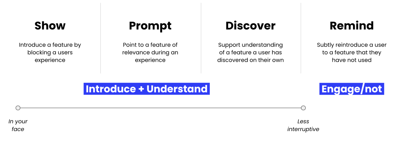
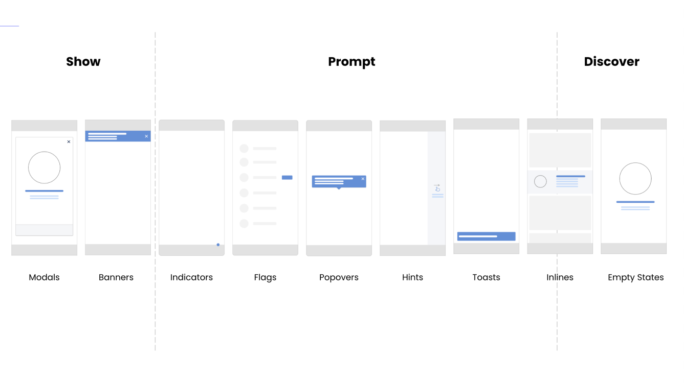
Use a set of principles to define the type of onboarding used for a feature...
Is there a better way to structure all our content online?
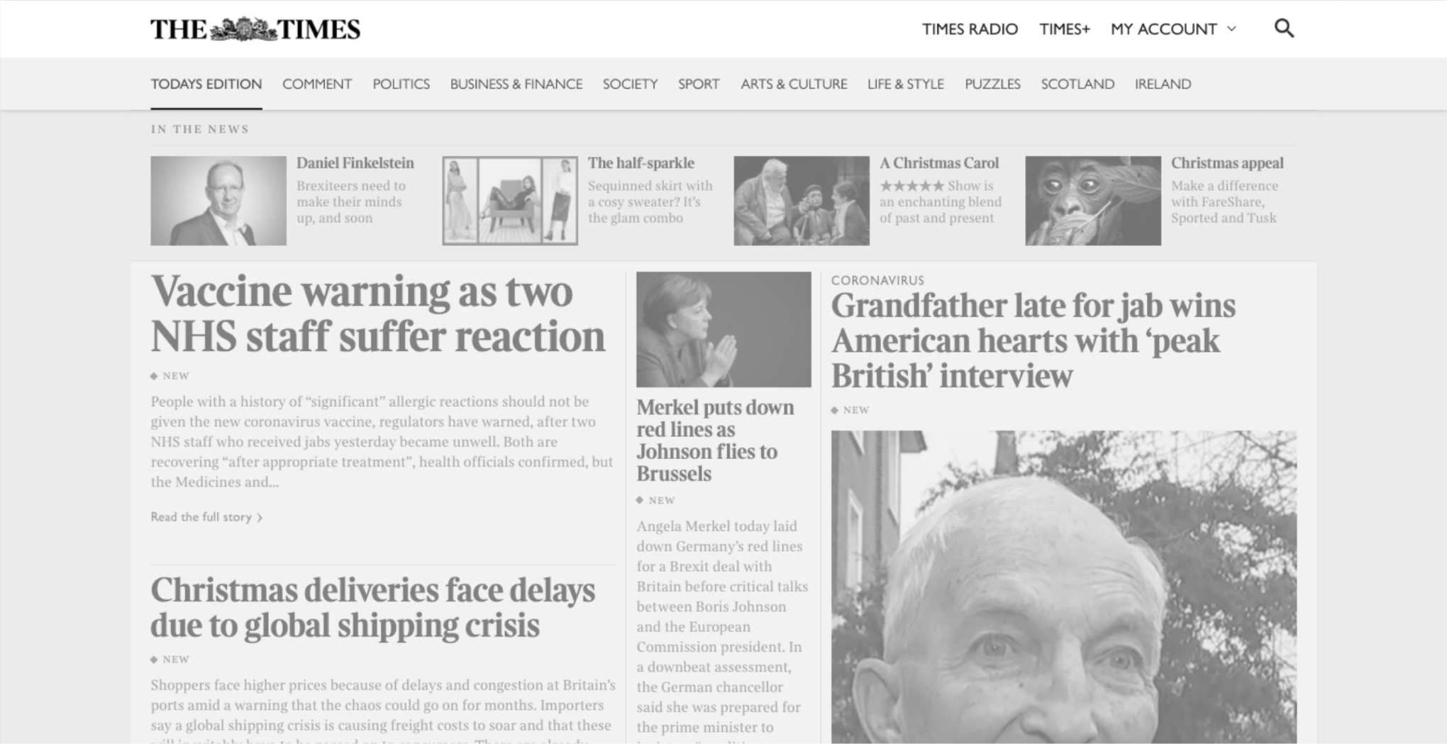
What would happen if we removed the edition sub-nav as it is currently and use it more as a front page? Just like we are doing with the new contemporary tablet & mobile apps.
- Participants in this test showed interest in channels pages and how they are structured.
- Is there a case to reorder edition section into channel style pages.
- It would give the ability to remove the explore tab and have all channels surfaced at the top
- V1 could be to remove edition sub-links and feature more channels (easy test)
- Reduces confusion with duplicate links.
- Potential to get users to the content they want quicker
- Each channel could display today’s news at the top and past content below (one source of content)
- Allows for expansion of new content/features. Eg. Breaking news
Conclusion
In my time at The Times & Sunday Times, navigation was a big topic of conversation throughout the team. The proposal for restructuring the content of the site has implication on a business model level. This was left to the SLT to deliberate before we did any more testing. From a UX point it makes total sense and the small amount of testing we did prior to this one proved that the majority of users were much happier with this content but there were a select few that thought it was moving too far away from what they consider key USPs of the business.
Whilst this was being deliberated I then moved to a new job so I never got to see the outcome. As it stands the navigation hasn’t changed from what it was before we did any of this research so I can only assume it's ongoing. Although the research was implemented the tests we conducted showed the importance of putting users needs above everything to improve a product.